In his booklet on graphic design, Massimo Vignelli emphasized semantics (researching the subject you’ll design about), syntax (making your design consistent and harmonious), pragmatics (giving your design a clear intent and lasting meaning), discipline (paying attention to detail), appropriateness (appropriating elements of previous designs for continuity), ambiguity (making a design that could be interpreted multiple ways), design is one (design is a versatile discipline). I like Vignelli’s advice, I feel like a lot of it is principles that people who like design tacitly knew but he put a label on them.
Balance:
This palace’s width and symmetry give it mass and project power.
Color:
This buildings solely white color gives it a stark, futuristic look. I saw it passing on the highway so I’m not sure what its purpose is, maybe a hall or monument.
Minimalism:
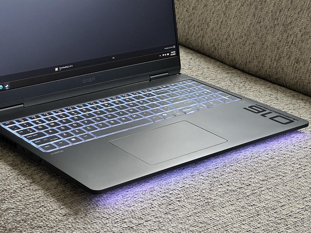
This laptop’s uncluttered, simple design draws attention to the model name and brand, but makes it look professional and sophisticated despite packing a powerful GPU and cooling system. The LED bar under it is one of the only giveaways that its a gaming laptop.
Typography:
This post I made for service learning course uses Baga font, which my group chose for our posters because we thought its soft edges communicated the warm, friendly atmosphere of Gwen Hale Resource Center.